Images below are rendered from a synthetic test data set and are for
demonstration purposes only.
All three settings only change how the 3D plume image looks.
None of them touch the underlying data: every point stays part of the
kriging interpolation, the audit report is unaffected, and the
downloadable cleaned dataset is identical no matter what you pick here.
You can change these and re-run a job as many times as you like without
ever altering what was actually measured.
Color ramp
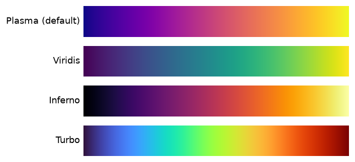
The color scale used for %RE (percent relative emission) in the 3D
plume render. All four options are perceptually-ordered scientific
colormaps (not a rainbow scale) — low response reads as a cool/dark
color, high response as a bright warm one.
Transparency threshold
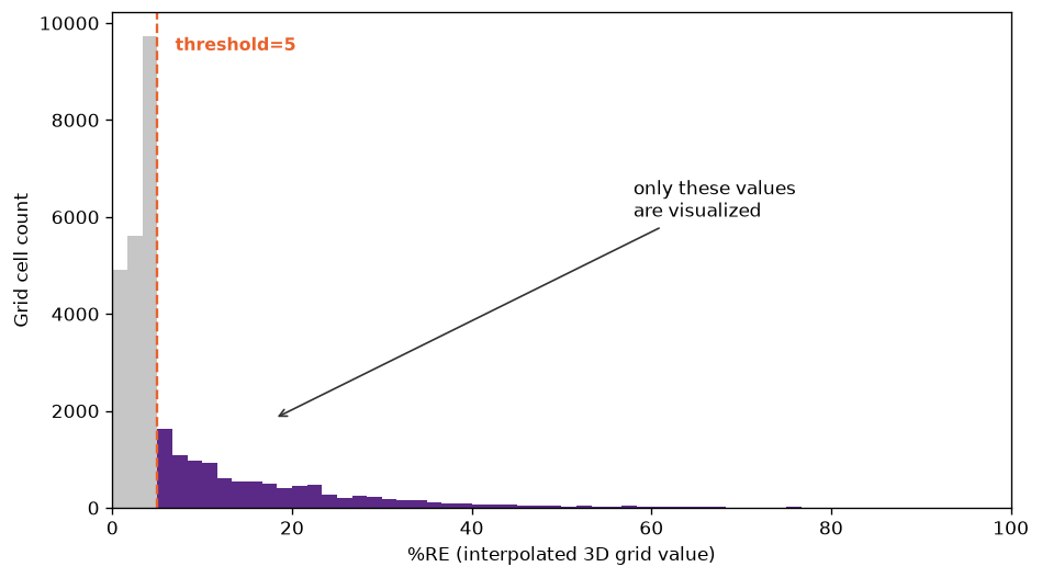
Users have the option of including a transparency threshold. Any
interpolated %RE value at or below this threshold renders fully
transparent. Use this option to reduce background noise in the image.
For example, see the histogram of values from the synthetic test
dataset below. Adjusting the transparency threshold (in this case, to
5%) hides values on the low end of the distribution, making the
higher-response areas easier to see in the 3D image.
Transparency ramp shape (Gamma value)
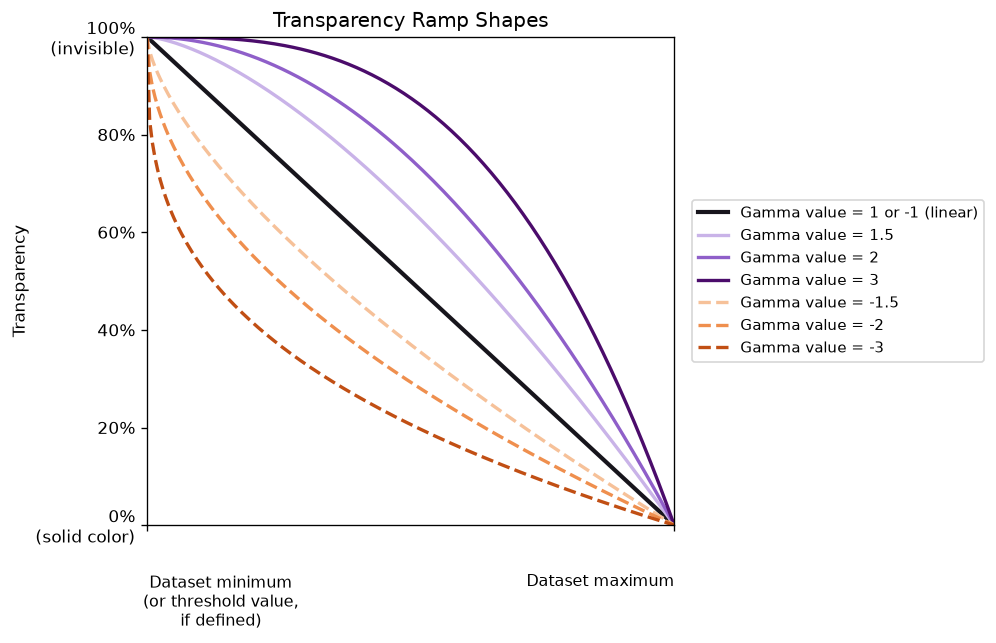
Once the threshold above has defined a visible range, we use a gamma
function to control how transparency changes across that range — from
fully transparent at the threshold to fully opaque (solid) at the
dataset's peak value. The "Gamma value" field defines the ramp's
steepness.
Transparency is decreased to the power of the value. Positive values
(e.g. 2, 3) suppress everything but the strongest response, for a
sharper, more solid hotspot with a thinner halo. Negative values (e.g.
-2, -3) do the opposite, boosting visibility of faint, near-threshold
response — useful if you want weak trace response to stay visible
instead of fading into the background. A value of 1 or -1 is a linear
ramp, where transparency decreases in direct proportion to %RE (this
is the default).
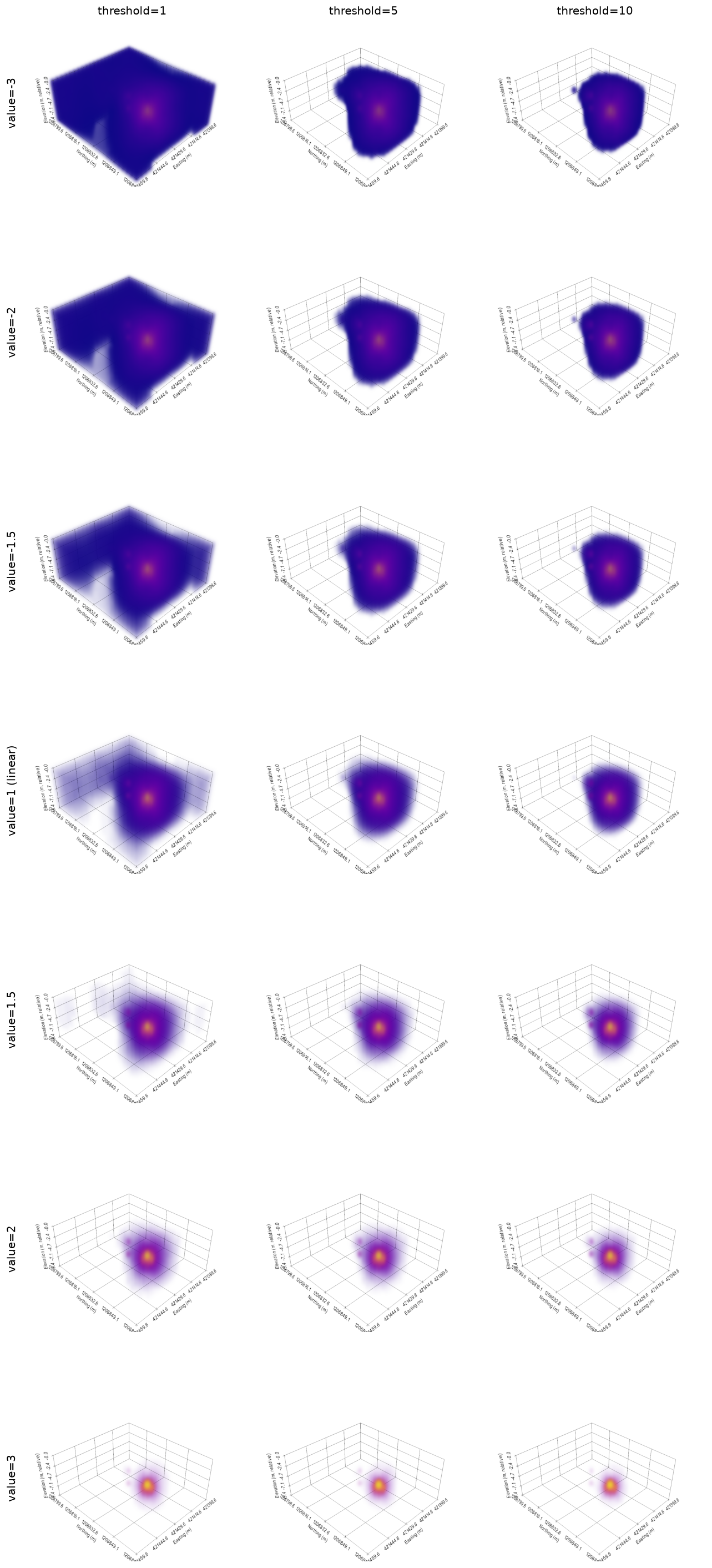
Gamma value / Threshold plot examples
Gamma value: 2D vs. 3D
The 2D and 3D views each have their own, independent
Gamma value — moving the slider on one tab does not change the
other, and switching tabs re-shows whichever value that tab is
currently set to. This is deliberate: the same gamma number
produces two genuinely different-looking results in the two views.
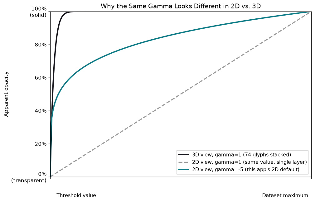
This is because the 3D viewer draws the plume as many small,
partially transparent glyphs, and the gamma value on the slider
affects each individual glyph. From most viewing angles, you are
actually looking at many glyphs "stacked" on top of each other.
The result is that many individual glyphs are blended together to
form a color and transparency that appears much more opaque than
any individual glyph. The 2D plan view has no such stacking effect
— it shows the single strongest %RE value found at each location,
colored by that one value alone (see the
interpolation methodology page for why it's the max, not an
average). So at the same gamma value, the 2D view shows a single
object while the 3D view shows dozens of partially-transparent
copies stacked on top of each other. This is why the 3D view
appears far more solid for what is, numerically, the same
setting.
To compensate, the 2D view starts at a much more aggressive default
gamma (-5, boosting faint response heavily) than
the 3D view typically uses, so a freshly-opened 2D view reads
closer to what the 3D view already shows. This is a reasonable
starting point, not an exact match — a single gamma curve
mathematically can't reproduce the shape of ~70 stacked, blended
glyphs (notice in the chart above that even the boosted 2D curve
still falls short of the 3D curve especially near the threshold) —
so feel free to keep adjusting the 2D tab's own Gamma slider from
there until it looks right for a given site.
Glyph size
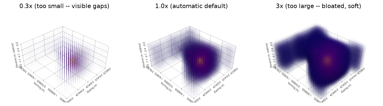
The 3D plume in the interactive viewer is drawn as a cloud of many
individually-colored glyphs (small shaded spheres, one per
interpolated location), not a solid surface. Each glyph is sized
in on-screen pixels, not real-world units — so the same glyph size
can look perfectly smooth at one zoom level or boring layout and
show visible gaps at another, since a fixed pixel size covers
fewer real-world inches the closer you zoom in. The app
automatically picks a sensible starting size for your specific
data, but if you ever zoom in and start seeing a gapped or
checkerboard-like pattern, drag this slider up until it smooths
back out — or drag it down if a hotspot looks overly soft or
bloated for your liking.
This only changes how the existing data is drawn, and only in the
3D viewer — every interpolated location stays part of the same
underlying data, with the same %RE value, no matter where this
slider sits.