Every 3D view, 2D view, and volume estimate on the results page comes from the same interpolation.
A boring only tells you the %RE response at that one location, at
discrete sampled depths. Below we describe the method used to
estimate what's happening in the space between and around your
borings, filling in a full 3D grid from those discrete samples.
The problem: estimating between borings
A site is only ever sampled at a handful of discrete locations and
depths. To draw a continuous 3D plume, or estimate a volume of
material exceeding some %RE threshold, something has to fill in
the gaps between those samples with a reasonable estimate.
The simplest approaches — connecting the sampled points with
straight lines, or just using whichever sample is nearest — treat
every gap the same way, with no regard for how spatially
correlated the real %RE response actually is, and no sense of how
confident the estimate should be in a sparsely-sampled area versus
a densely logged one.
Kriging
Kriging is a geostatistical interpolation method: it predicts a
value at an unsampled location by weighting the surrounding known
samples, rather than treating every nearby sample equally. The
method rests on a simple geographic principle —
spatial autocorrelation: two locations close
together tend to have more similar %RE responses than two
locations far apart. Kriging turns that principle into real
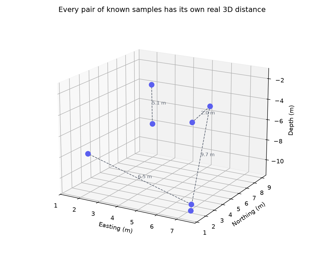
numbers by looking at the distance between every pair of known
samples.
A schematic, not a computed result — every pair of known samples (borings, at their real depths) has its own real 3D distance. Kriging uses exactly these distances, for every pair, not just the four shown here.
To turn those distances into weights, lif-viz builds a
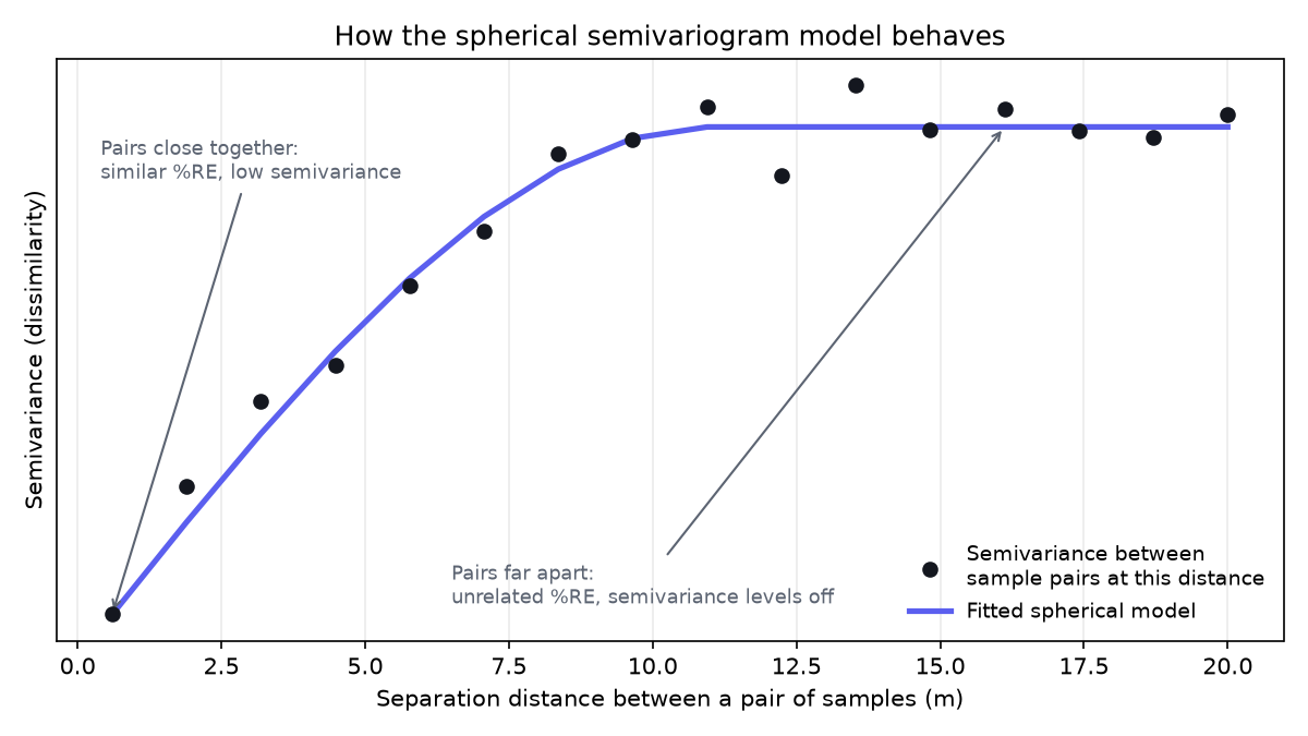
semivariogram: for every pair of known samples, it
plots how different their %RE values are against how far apart
they are. Pairs close together typically land low on that plot
(similar values, low dissimilarity); pairs far apart typically
land higher (less related values) — up to a point, beyond which
distance stops making the pairs any less related.
An illustrative semivariogram — dissimilarity between sample pairs rises with distance, then levels off once pairs are far enough apart that distance no longer explains how related they are.
A mathematical curve is fit to that pattern — lif-viz uses a
spherical model, a standard, well-established
choice for environmental %RE data. That fitted curve is what
actually produces the interpolation weights: a sample gets more
say over a prediction the closer and more correlated it is, and
less the farther and less correlated it is — a more sophisticated
rule than "nearest sample wins," because it reflects the real,
measured spatial structure of this site's own data, not a fixed
assumption applied to every site the same way. Note that the
estimate is exact at every real sample location - the kriging
method never contradicts real measurements.
lif-viz uses ordinary kriging — the variant that
assumes an unknown but locally constant mean, rather than requiring
you to already know a trend across the site. The interpolation
runs on the cleaned, canonical dataset described in the audit
report, at every job, before any visualization is drawn.
Like any interpolation method, kriging is only as good as the data
feeding it — it can't invent information about parts of a site with
no nearby samples, and a wide, high-variance area on a real kriging
variance surface is telling you exactly that: more borings would
narrow the uncertainty there. The 3D view and volume estimates
elsewhere on this page are estimates built on real statistics, not
a claim of certainty everywhere on the site.
The results page's 3D View tab renders the full
computed kriging grid directly in three dimensions — every
interpolated cell at its own real (easting, northing, depth)
position, colored by %RE using your chosen color ramp. Drag to
rotate, shift-click drag to pan, and scroll to zoom, so you can see
the actual shape of the response in space: which depths carry it,
whether it's a thin layer or a tall column, and how that shape
changes as you adjust the transparency threshold or gamma value
(see the visualization-options
help page for what those controls do).
This is the one view that shows the true vertical structure of the
interpolation — the detail the 2D View below necessarily collapses
away to produce a single flat image.
2D View
The results page's 2D View tab is a
top-down projection of the exact same 3D kriging grid used by
the 3D view — it is not a second, separate interpolation, and
it does not use a different statistical model. At every
(easting, northing) location on the grid, the plan view shows
the single highest %RE value found at any depth
below that point, so a plume that is strongest at 4 m depth and
a plume that is strongest at 9 m depth both show up at full
intensity in the same flat image.
Note that the plan view is displayed (and exported as a GeoTIFF)
as a smoothed version of
the underlying grid, using a 2D spline fit purely for display
so the plume reads as a continuous cloud rather than a blocky
grid of cells. The smoothing never changes which cells the
kriging model actually computed — it's the same values, just
interpolated onto a much finer image for a nicer-looking result
— so the plan view and the 3D view always agree on the
underlying plume shape.